Sunday Funnies 9: Assemblies

Detail of cocktail recipe construction chart

Due: 4/12

For some unknown reason, the National Archives includes a document entitled Cocktail Construction Chart, which was created by the US Forest Service in 1974, showing recipes for a group of cocktails represented in the style of an architectural diagram.

cocktail-assembly-chart-all


For your next Sunday Funnies assignment, choose some compound thing from your life and break it down into its component parts, represented in some sort of an architectural diagram like this one. I’m less interested in the quality of the drawing itself and more in your analytical ability to break down something complicated into a series of steps and to represent that as if in such a diagram.

(Earlier today, I went through all the syndicated posts and cleaned up the tags. Please make certain to tag your post with “Sunday funnies” and with “sf9” and then you can add any other tags you might want to use as well.)

Sunday Funnies 8: Sunday sketches

A mixed gorilla face made by sketching around audio headphone cans

Christoph Niemann is an illustrator, artist, and author whose work regularly appears in the New York Times, the New Yorker, and elsewhere. He’s got a mixed media series that he calls “Sunday Sketches” (some examples in his portfolio here or check out his Tumblr for more), in which he takes some object from his surroundings and creates a sketch on the page around it.

For this week’s Sunday funnies assignment, make your own Sunday sketch in a similar style.


(image credit: “Sunday Sketching: #headphone #gorilla” by Christoph Niemann)

Sunday Funnies 7: A Human Document

Screen capture of multiple pages of Tom Phillips' Humument

Due: 3/29

The British artist Tom Phillips is probably best known for a project that he began in 1966 and which he has continued ever since–he set himself the challenge to buy the first book he could find at a secondhand bookstore for threepence and to alter every page using drawing, painting, collage, and cut-up techniques to create an entirely new version.

First page of the 1970 edition of Humument.

First page of the 1970 edition of Humument.

He found W.H. Mallock’s A Human Document and combined the words in the title to create A Humument. Phillips not only created new art works from each of the 367 pages but has now completed five different editions of this altered book.

You can view pretty much the complete series of pages on Tom Phillips site here. You can choose pages, view the original and then view different versions of that page.

For this week’s funnies assignment, I want you to create your own visual poem-thing. You can find your own page to alter if you’d like, but I’ll bring in an old used book that you can take pages from too. Think of it as sort of a collaboration between yourself and the book’s original author or think of it as a game where you get to create new text but within the strict confines of the text available on the page.

Obviously, Tom Phillips has been doing this for almost 50 years and I’m not expecting you to produce work that is as polished or complex as his–nor that is necessarily as visually compelling. And it will probably feel very strange to you as you begin, but just let yourself be playful and experiment with your task. You do not need to be a professional artist to make these pages, but you probably do need to be able to relax your desire to be in control of what you produce and you probably need to turn off the self-critical voice that will tell you that you’re doing it wrong.

Alter your page using whatever methods or tools you prefer, then scan the page in color at a high resolution as a JPG or PNG file and load it to your site. You might include in your post the text of your altered page.

(featured image credit: Screenshot of Google image search screen for Tom Phillips Human Document.)

Sunday Funnies 6: Visualize a Quote

Detail of Zen Pencil's illustration of Bill Watterson quote

Due: 3/22

First, a little bit of inspiration: Take a look at some of the comics that Zen Pencils creates by taking an interesting quote and then creating a comic to illustrate it. (I particularly like Bill Watterson, Jim Henson, Amelia Earhart, and Ira Glass.) Notice how his comics are related to and inspired by the quotes he’s working with but are not simply literal translations of them.

And a second bit of inspiration: Find a quote that inspires you, probably a fairly long quote, at least a paragraph (though length is offered here only as a suggestion, not a rule).

Now illustrate your quote with an image or a series of images. You do not need to make a cartoon like Zen Pencils does, though you can if you’d like to. You can use a series of photographs of your own or CC-licensed ones or draw illustrations. If you’d like to make a video using iMovie, that would be cool. Your goal is to come up with something that takes someone else’s words, puts your own personal spin on them, in order to create a visual representation of the quote.

(image credit: Detail from “ZEN PENCILS » 128 BILL WATTERSON A cartoonist’s advice“)

Sunday Funnies 5: Mapping Tracing Persepolis

Map of Iran with diagram of places visited

Due: 2/29

For this week’s Sunday Funnies project, you will make a map of one of your peer’s Tracing Persepolis projects.

  • First, go this spreadsheet and add your name in the right-hand column next to the student project that you will map. By the end of tonight, every student on the left-hand column should have one and only student signed up to map their project in the right-hand column.
  • Find the student’s post in the course feed, read that student’s statement about his or her goals for the project, and follow the link posted to the splash page. Read carefully through the pages and subpages that make up the project and think about the claims this student makes.
  • Draw a map, or a diagram, that visually represents the project as a whole. You can draw your map by hand and then scan it to include in your post, but I encourage you to think about using mind mapping software (like bubbl.us, text2mindmap, or XMind) to create your diagram. Part of the purpose of your diagram is to create a reverse outline ((Here is a handout on reverse outlining. It does not apply exactly, because it assumes a linear, thesis-driven argumentative essay, which is not exactly what you are doing with the Tracing Persepolis pojects. However, the basic outline for how reverse outlining works are still applicable.)) of your peer’s argument, so one component of your map should be to include a list of the main ideas for each page of the project. Try to also represent the ways in which the different pages relate to each other (especially if they are internally hyperlinked to each other, represent the paths of those hyperlinks as best you can).

Your primary purpose with this Sunday Funnies assignment is to create a visualization that will help your classmate to see his or her argument as clearly as possible so that opportunities for revision become clear. Your peer should be able to hold your visualization up against his or her project and use it as a tool to ask whether the argument is laid out as clearly as possible, whether claims are fully supported, whether there are additional points to pursue from here, and whether the argument is convincing. (You do not need to answer any of those questions for them, but your visualization should help them to answer those questions for themselves.)

Your secondary purpose is to better understand how your peer has shaped this project with an eye towards better understanding and revising your own argument. Hopefully, in the process of mapping out a peer’s project, you will identify aspect of your own argument that you might think about differently.

(image credit: “My trip to Iran” by Flickr user Örlygur Hnefill)


Sunday Funnies 4: Daily Routine Infographic

Screenshot of Google image search for "best infographic makers"

Due: 2/15

Last week, you tracked your daily schedule using the 7 categories we agreed upon as a class. Now it’s time for you to turn that data into an inforgaphic. There are lots of programs that you can use to create infographics. I’ll recommend that you use Infogram mostly because it works from either their built-in spreadsheet system or you can upload your data from files you’ve got.

If you can manage to create a visualization like Podio’s Daily Routines of Creative People that not only shows how much time you spent on each activity but at what time in the day, then that will be great. However, for the sake of simplicity it will be enough if all you report is how many hours you spend on each activity each day for the week. You can choose whichever type of charts you think works best.

You can only save your infographic as a JPG if you upgrade to the paid version of Infogram. However, you can embed your work easily. Once you’re finished making your chart, just click on the Share button at the top of the page, then copy the embed code in the dialog box. Then log in to your site’s dashboard and create a new post. On the top right corner of your text editor, switch from Visual to Text and then paste your code in.

Here’s a link to the Infogram help pages.

(image credit: screenshot of Google image search for “Best Infographic makers“)

Sunday Funnies 3: Visual Note Taking

Comic representation of Domain of One's Own

Due: 2/1

Create a set of visual notes for one session of a class that you are currently enrolled in.

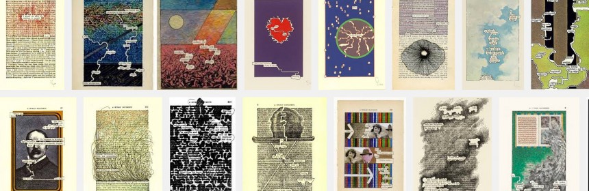
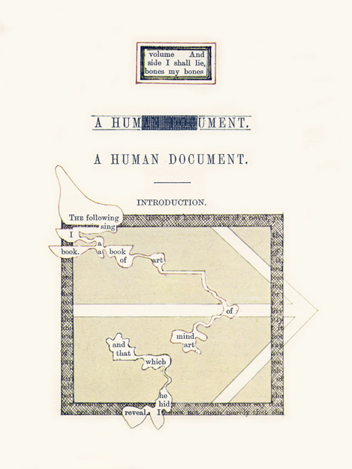
I’m a big fan of the work of Giulia Forsyth. She works in a teaching and learning center, where she helps professors and instructors be more innovative in their teaching practices, and she also works as a visual note-taker and facilitator, which means that she is sometimes employed to go to presentations and meetings and to doodle notes for the meeting.

Check out this four minute video where she gives a quick summary of how she began to take her doodling seriously and where it has led her:

On her Visual Practice page, Forsyth has lots of videos and images explaining how she approaches the task of producing drawings that help her and others to not just grab the information that’s been presented in a class or discussion, but to grapple with the material and better understand it. You can also see numerous examples on her Flickr page, especially her Visual Practice album.

For your Sunday Funnies assignment this week, I want you to create a set of visual notes for one day in one class (other than ENG101) that you are currently enrolled in. You do not need to take your visual notes in real time; in fact, I recommend that you don’t. I recommend that you go to your classes and take notes in whatever manner you normally do, then after class go through your notes and recreate them as visual notes.

You do not need to draw your notes in a digital environment, either, though you are certainly free to do so. If you prefer to doodle with pen, pencil, or marker on paper then do that and once you’re done with your drawing, just scan the pages as JPG files so you can upload them to your site. If you have an iPad or other tablet or would like to draw on your laptop or desktop, then you might try apps like Inkflow or Adobe’s Sketchbook or search for other free/cheap drawing applications. I am completely tool agnostic on this assignment, so make your drawings in whatever manner make sense to you.

Your visual notes do not need to be polished or beautiful or anywhere near as intricate as Forsyth’s. Do try to take this assignment as an opportunity to really engage differently with your material–don’t just make a series of doodles that follow the outline of the lecture or discussion in your notes but try to really translate the concepts and information into a new, visual set of notes.

Once you’ve got your notes, load them onto your course site as a post in your Sunday Funnies category. Make one of your notes pages a featured image.

As you upload your visual notes, take a few moments to reflect on the process and then write a paragraph or two about what you learned during the process of creating your visual notes. Did it help you to understand the course content any differently or better to create notes visually rather than just as text? Did you discover anything new about yourself or the way you think in the process? Did you find it enjoyable or find some aspect of it particularly interesting? Someplace in your reflective text, create a link back to this blog post assignment.

(image credit: “Domain of One’s Own” by Flickr user Giulia Forsyth)

Sunday Funnies 1: Badges

Stinking badges? badge

Due: January 20

(Note that these Sunday Funnies assignments will normally be due on Sundays. However, given that we’ve just started and Monday is a holiday, I’m giving you until Tuesday to make your badge and get your course subdomain published.)

First, read this Domain Documentation page on creating your own badges. We’ll talk some in class about Creative Commons licensed images.

Then create a badge for yourself. Start by choosing one or more of your own photos as the basis of the badge, drawing something yourself and scanning it, or finding one or more CC-licensed images on Flickr that you can modify. Make certain to keep a note for yourself of the URL for the photos you use if they are not your own.

Crop and otherwise edit the photo(s) in a photo editing application (like Photoshop or PicMonkey). You can create a layered or collage effect, if you’d like. Add your name on your badge in such a way that it’s legible. You might also include your domain URL, but that’s not required.

Your final badge should be 300 pixels wide by 250 pixels high.

When you’re done, load the badge into your Media Library and publish it to your site in a blog post. Include information and links in the post about the source(s) for images included in your badge.

Write a brief paragraph about why you chose those images, what aspects of yourself and your interests are represented in your badge, and/or what difficulties you faced in creating the badge.