Stefanie Posavec’s data visualizations of literary texts

Line drawing showing sentence lengths in first chapter of The Great Gatsby
EspositoOnMoretti_pdf

“First Chapters” by Stefanie Posavec. Qtd in “Distant Reading” by Scott Esposito. The Point 9: 2015, 183-93.

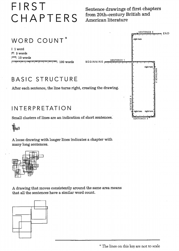
The featured image above is a map of the first chapter of The Great Gatsby, created by Stefanie Posavec as part of a series called First Chapters, in which she took the first chapters of a series of literary works and counted how many words were in each sentence, mapping the lengths of the sentences according to a very simple set of rules (see “First chapters“, to the right).

She has also mapped the first chapters of Cannery Row, A Room of One’s Own, Beloved, On the Road, and many more.

The analytical process is really simple and the tools necessary are so easy–any software that can plot a line of a certain length would work. And if you wanted to add another layer of complexity to the process, you could easily make lines different colors or use different line types (wavy lines, dotted lines, jagged lines, big thick lines, etc) to convey something about the sentences besides just length, say tone or style.

These mapping techniques would not work wholesale for the Fun Home projects that you all are working on; you probably wouldn’t get very far with mapping out sentence lengths given the visual nature of the graphic novel. However, can you think about ways that you might do something similar with graphic novels?

You might also check out some of the other types of literary maps that Posavec has produced. She created an iPhone app for Stephen Fry’s book that uses tags and a circular data visualization in order to allow readers to move in a nonlinear fashion through the book. She also created a data visualization of the lyrics of an OK Go album, which became the album’s cover and other artwork. She’s got lots of other similar cool work, which might spark ideas for you.

Detail from "(En)Tangled Word Bank by Stefanie Posavec and Greg McInerny, representing one of the six editions of Charles Darwin's The Origin of Species. The shapes represent every chapter of this edition of the book, and the color indicates whether that paragraph remained in the next edition of the book.

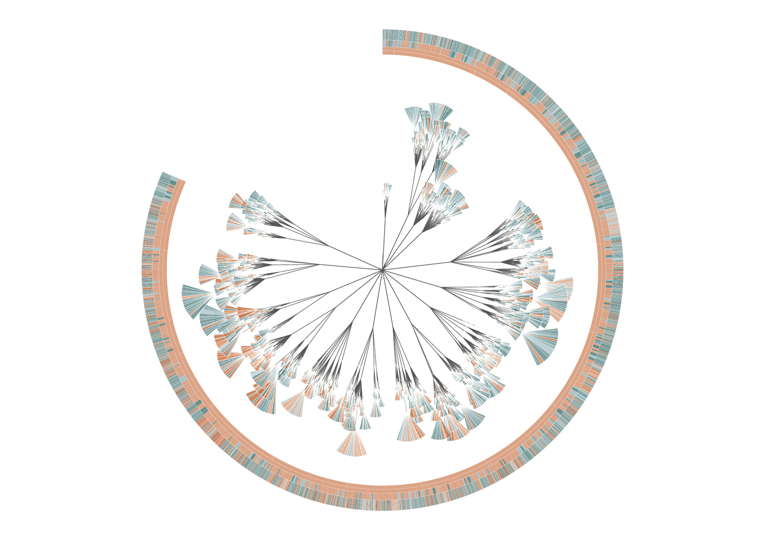
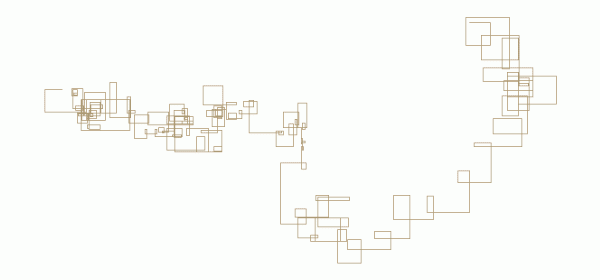
Detail from “(En)Tangled Word Bank by Stefanie Posavec and Greg McInerny.

The image to the left shows one of the series of data visualizations that Posavec and Greg McInery created epresenting the six editions of Charles Darwin’s The Origin of Species. The shapes represent every chapter of this edition of the book, and the color indicates whether that paragraph remained in the next edition of the book.

Two more resources that might be helpful for you

Data visualization of Charles Minard's flow chart of the Napoleonic War

Highcharts

Highcharts is an interactive JavaScript system for creating interactive data visualizations. It’s free for noncommercial use and allows you to embed your charts. I could imagine that some of these charts and graphs might be useful for you–one of these two types of heatmaps (heatmap 1, heatmap 2) or a treemap like this one might be a useful way for you to visualize your argument. You’ll have to work with Java code a little bit, but Highchart’s embedded editor makes it not too awfully complicated to play around.

Vida

Vida.io offers another set of JavaScript data visualization tools, including quite a few different options like Sankey diagrams (energy flow sankey diagrams and funnel flow sankey diagrams). Here are three posts to find out more about Sankey diagrams:

250 Best Movies as a Subway Map

I can no longer find the original post at Vodkaster, but a few years ago they came out with their list of the 250 greatest movies of all time, but instead of just making a simple internet list, they produced a data visualization showing those movies in the format of a subway map. Here’s the map, which Miramax reposeted (click to embiggen):

Film genres are represented as lines: Romance, Comedy, Drama, Western, Sci-Fi, Fantasy, Animated, and so on. Movies that span multiple genres are represented as stations or nodes. Lines generally progress chronologically.

Think about how many different elements of information, and different types of relationships between information, are conveyed in this single image.

Bechdel’s spreadsheets

I was looking for an image on Flickr today and stumbled upon a few photos from a conference on Comics Philosophy and Practice that might be of interest to you.

These two spreadsheets are not from Fun Home but its sequel, Are You My Mother? (And here’s a more close-up shot of the latter.) That’s Bechdel on the right, discussing the spreadsheets–she seems to be outlining the process by which she went about organizing the narrative threads into the book. I don’t know if she used a similar spreadsheet for Fun Home too, but it’s safe to say based on the book itself and these images, that Bechdel very carefully structures and organizes the narrative and thematic elements of her books.

These photos of Bechdel’s presentation might help you to think about how to analyze the structure of Fun Home for your projects.

Sunday Funnies 5: Mapping Tracing Persepolis

Map of Iran with diagram of places visited

Due: 2/29

For this week’s Sunday Funnies project, you will make a map of one of your peer’s Tracing Persepolis projects.

  • First, go this spreadsheet and add your name in the right-hand column next to the student project that you will map. By the end of tonight, every student on the left-hand column should have one and only student signed up to map their project in the right-hand column.
  • Find the student’s post in the course feed, read that student’s statement about his or her goals for the project, and follow the link posted to the splash page. Read carefully through the pages and subpages that make up the project and think about the claims this student makes.
  • Draw a map, or a diagram, that visually represents the project as a whole. You can draw your map by hand and then scan it to include in your post, but I encourage you to think about using mind mapping software (like bubbl.us, text2mindmap, or XMind) to create your diagram. Part of the purpose of your diagram is to create a reverse outline ((Here is a handout on reverse outlining. It does not apply exactly, because it assumes a linear, thesis-driven argumentative essay, which is not exactly what you are doing with the Tracing Persepolis pojects. However, the basic outline for how reverse outlining works are still applicable.)) of your peer’s argument, so one component of your map should be to include a list of the main ideas for each page of the project. Try to also represent the ways in which the different pages relate to each other (especially if they are internally hyperlinked to each other, represent the paths of those hyperlinks as best you can).

Your primary purpose with this Sunday Funnies assignment is to create a visualization that will help your classmate to see his or her argument as clearly as possible so that opportunities for revision become clear. Your peer should be able to hold your visualization up against his or her project and use it as a tool to ask whether the argument is laid out as clearly as possible, whether claims are fully supported, whether there are additional points to pursue from here, and whether the argument is convincing. (You do not need to answer any of those questions for them, but your visualization should help them to answer those questions for themselves.)

Your secondary purpose is to better understand how your peer has shaped this project with an eye towards better understanding and revising your own argument. Hopefully, in the process of mapping out a peer’s project, you will identify aspect of your own argument that you might think about differently.

(image credit: “My trip to Iran” by Flickr user Örlygur Hnefill)