Mapping Fun Home
Due: April 5
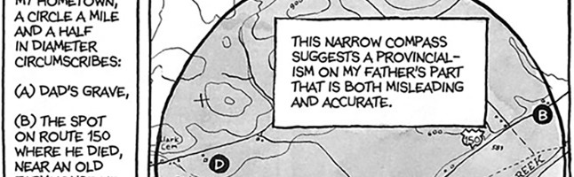
For this project you will draft a “model” or a “map” — not necessarily a geographic map — that highlights spatial, temporal, thematic, or structural elements of Alison Bechdel’s Fun Home.
A “map” does not necessarily have to be a cartographic map; in fact, the last thing I want is a faithful map of all the “places” in the novel. Rather, by “map” I mean a model: an abstract visual representation of some element of the novel that captures its complexity and reveals a pattern or set of relations that a straightforward reading might overlook.
In an article called “Graphs, Maps, and Trees,” the critic Franco Moretti makes a case for creating what he calls literary maps:
What do literary maps do . . . First, they are a good way to prepare a text for analysis. You choose a unit — walks, lawsuits, luxury goods, whatever — find its occurrences, place them in space . . . or in other words: you reduce the text to a few elements, and abstract them, and construct a new, artificial object. A model. And at this point you start working at a ‘secondary’ level, removed from the text: a map, after all, is always a look from afar — or is useless, like Borges’s map of the empire. Distant reading, I have called this work elsewhere; where distance is however not an obstacle, but a specific form of knowledge: fewer elements, hence a sharper sense of their overall interconnection. Shapes, relations, structures. Patterns. (New Left Review 26 (2004), p. 94)
There are a number of ways to approach this inquiry. For examples of different kinds of mapping visualizations, browse through the Periodic Table of Visualization Methods. I encourage you to be creative and to make use of any style or tool necessary. You can be as low-tech or high-tech as you want. Your map can be hand-constructed–so long as you can convert it into a digital form to include on your website. Or you can use sophisticated born-digital tools. Like Piktochart, infogr.am, visual.ly or other infographic makers. Or mapping software like Bubbl.us or CMap. Or timeline tools like Timeline, Tiki-Toki, or Simile widgets. There are lots of other digital data visualization tools, such as those highlighted here, here, or here.
Whatever form your “map” takes, be sure to include a legend or key that explains the information represented.
Once your map and legend are complete, you can turn to the next part of the inquiry. In about 1000 words (roughly 4 pages in traditional text essay terms), reflect upon what your model reveals about Fun Home. How does this abstract model of the novel encourage a “distant reading” and what does that reading tell us? How does the map reveal qualitative or quantitative aspects of the memoir that would elude a typical close reading? Also, walk us through your thinking process: what element(s) of the novel were you trying to convey, and why did your “map” take the shape it did? Finally, how does your map succeed, and what are its limitations?
You’ll upload your map and the accompanying reflective essay as one or more static pages to your website. (More on the particular details of how that should look very soon.)
I’ll link to a number of maps and visualizations that might inspire you as you work on this assignment in the course blog.
Is it due March 27th or April 3rd? From the original syllabus I have April 3rd marked in my calendar, but March 27th is posted on the actual project page.
It’s due April 3.
Pingback: Week ahead: Ides of March Edition | Experiments in Visual Writing
Pingback: Week ahead: 11 | Experiments in Visual Writing
Pingback: Mapping Fun Home | Rype English
Pingback: Mapping Fun Home — Literary Experiments
Pingback: Mapping Fun Home - English 101
Pingback: Mapping Fun Home | English 101
Pingback: Mapping Fun Home | My English Class
Pingback: Mapping Fun Home | DanBus Thoughts
Pingback: Mapping Fun Home | Journal
Pingback: Mapping Fun Home | English 101
Pingback: ENG 101 Reflection | ENG 101
Pingback: Experiments in Visual Writing » Mapping Fun Home
Pingback: Mapping Fun Home | Graphic Comp